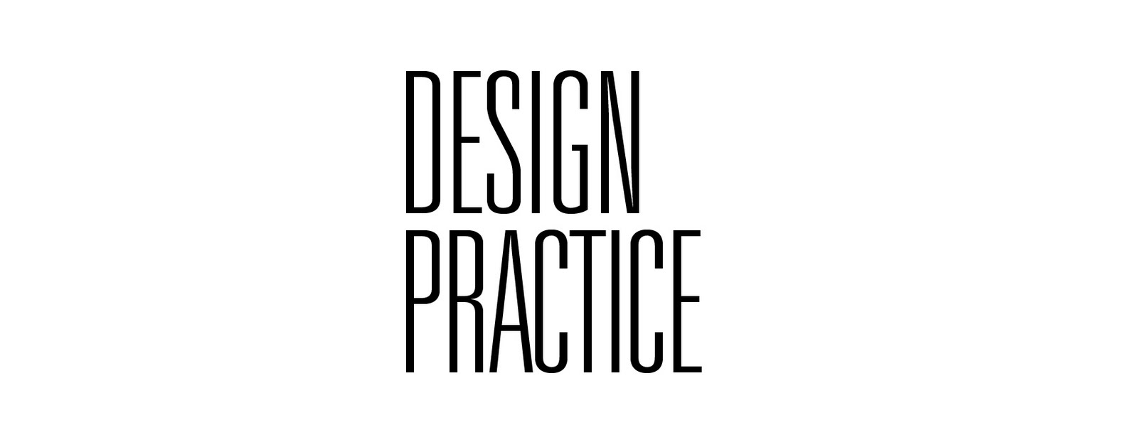
Further typeface development.
It's slowly becoming an obsession. I need to move onto another character.
Not much development going on as such. I was just trying to perfect certain angles and the curves of the character.
I quite like the tall ones. I think they work well. I find the small and very tall R on the left very interesting. My least favourite has to be the two biggest ones. They seem to resemble a spider or an insect.
I then moved onto another letter. The letter C
Here are some initial designs.
Again i experimented with rounded and sharp edges as well as different angles.
I tried out different weights and different thickness of pens. I also sat it next to the newly developed "R" to see how it would work and also to see if both letters are consistant.
Some further development. Although I think it's working well with the angles I reckon I need to revise different angles/shapes. I think the two on the right have the most potential to work as a typeface (at this moment in time)


No comments:
Post a Comment