
A few logo ideas for speaking from
experience.

A simple joined up logo with the word "enjoy"
All lowercase,joined up and in italics to convey an informal message.

A smiley face in place of an "o".
Not too sure about this as it looks almost
"Primary school" and patronising for degree students
to look at.

Further logo development. Changing the flowy, joined up type to a thin, smart typeface so as not to patronise new degree students. The smiley face is to show the fun side of the course and the typeface is to show the serious side.

enjoy has now become
enjoy yourself.
Ditching the smiley face (too juvinille) but keeping the thin, smart type.
The message itself is informal enough so showing the message in a formal typeface shows a
"fun yet serious" message.


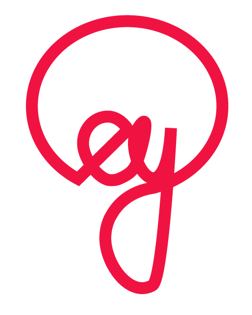
More development for "ey".

Here is the "ey" logo vectored. It looks like it would work and would be applied easily to alot of things - big or small.
It also resembles a lightbulb (kind of)

Thicker stroke weight.


experimenting with colour. Obviously colour is a vital part of communication. Bright colours would be suitable for this logo to show the informality of the pack.

"ey" logo on a business card/motivation card.


No comments:
Post a Comment