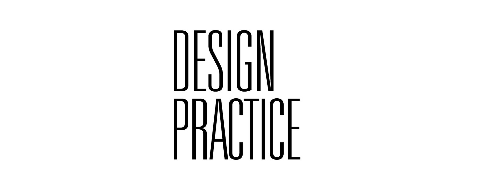
Further progress of the typeface.
Since the last time, I've included more angles into the typeface itself. The B for example has an extra kink to the crossbar. This adds more interest yet still relating to the angles of scandinavian buildings.
My favourite letter so far is the Q.
This was the old Q. The newer design is much more consistant with the other characters and is more recognisable as a Q.
NEW Q

Other successful letters are the R. I quite like the uncomfortable joints around the middle. A lot of scandinavian architecture are quite uncomfortable, visually, but have always been considered.
To get a real sense of how a typeface works, it's always best to try using the typeface to spell out
words. For this example, I've written the word TYPE. I think the new angles work really well, however the T and Y look very flat in comparison. They need to be more dynamic.
As a test I printed off my letter Q on a a4 piece of paper.
This was to see how the character functions on the page as well as how it handles when printed.
Just realised the crossbar on the Y wasn't consistant with the other characters so I've altered it as well as incorporating angular elements.


No comments:
Post a Comment