Eureka moment.
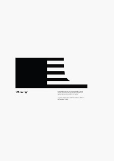
After hours of churning out rubbish design I had a "Eureka moment". All the way through the brief I was determined to keep it simple yet communicate well. No colour was to involved nor any images as such.
It doesn't seem to communicate anything at first glance. But that's what I wanted. I want people to engage in my poster and the fact people won't get it at first glance gives it longevity. The black block represents one half of the bottom of a sans serif font and to the right is half of a serif font.
To help people get it abit more I've included type "SANS SERIF" hopefully when they are drawn in to the poster by the big black "shape" they can read the type and understand it abit more.
Here I've included the definition of a "serif" This is to educate those who are unfamiliar with type terminology
Because my poster is purely about type termonaolgy I thought I need to stay true to the traditions of typesetting. Type sits on a baseline so I've added a "Baseline" as well as moving the information down to give it space to breath. I think this works really well and is my favourite out of all the designs
Here I have increased the weight of the "baseline" to match the thickness of the shape. I have also labelled each part of the shape " Sans serif" and "Serif" with their definitions below.


No comments:
Post a Comment